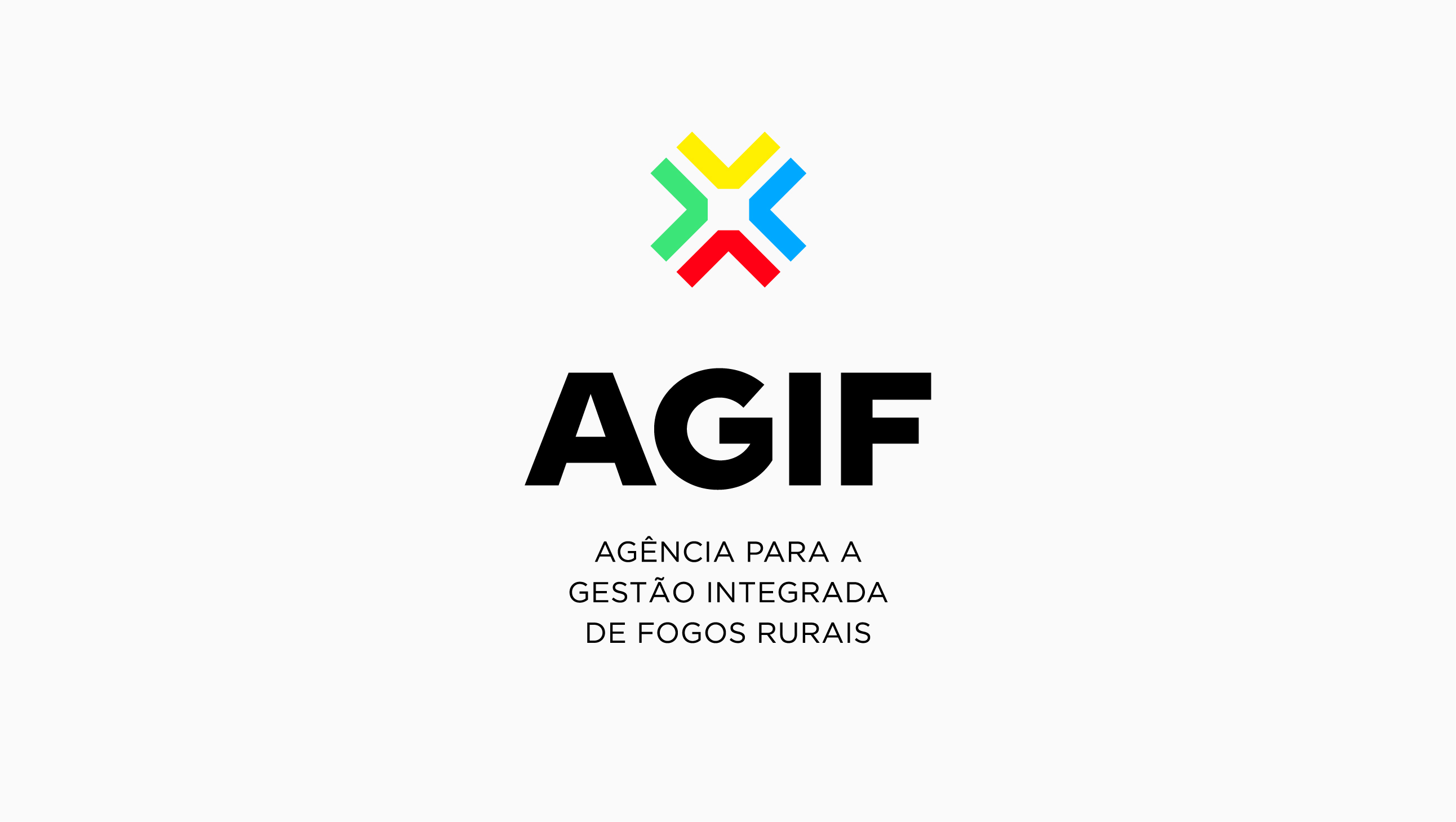
AGIF
Agency for the Integration of Rural Fire Management.
The brand identity for the agency that coordinates - strategically, integrally and crosswise - the implementation of the integrated rural fire management system in Portugal, by all responsible entities.
Agency for the Integration of Rural Fire Management.
The brand identity for the agency that coordinates - strategically, integrally and crosswise - the implementation of the integrated rural fire management system in Portugal, by all responsible entities.
Meaning
A symbol of integration, focus, logic and learning, that creates an ecosystem dedicated to everything involved in the management of rural fires: from information to knowledge, prevention to combat, and enhancement of the natural heritage to behavioural change.
The Colours
AGIF’s 4 Natural Elements
Red = Fire / Yellow = Sun / Blue = Water / Green = Forest
Google Effect
A combination of colours that contributes to the brand identity’s memorization, and positions AGIF, namely online, as an entity where you can research everything related to fire.
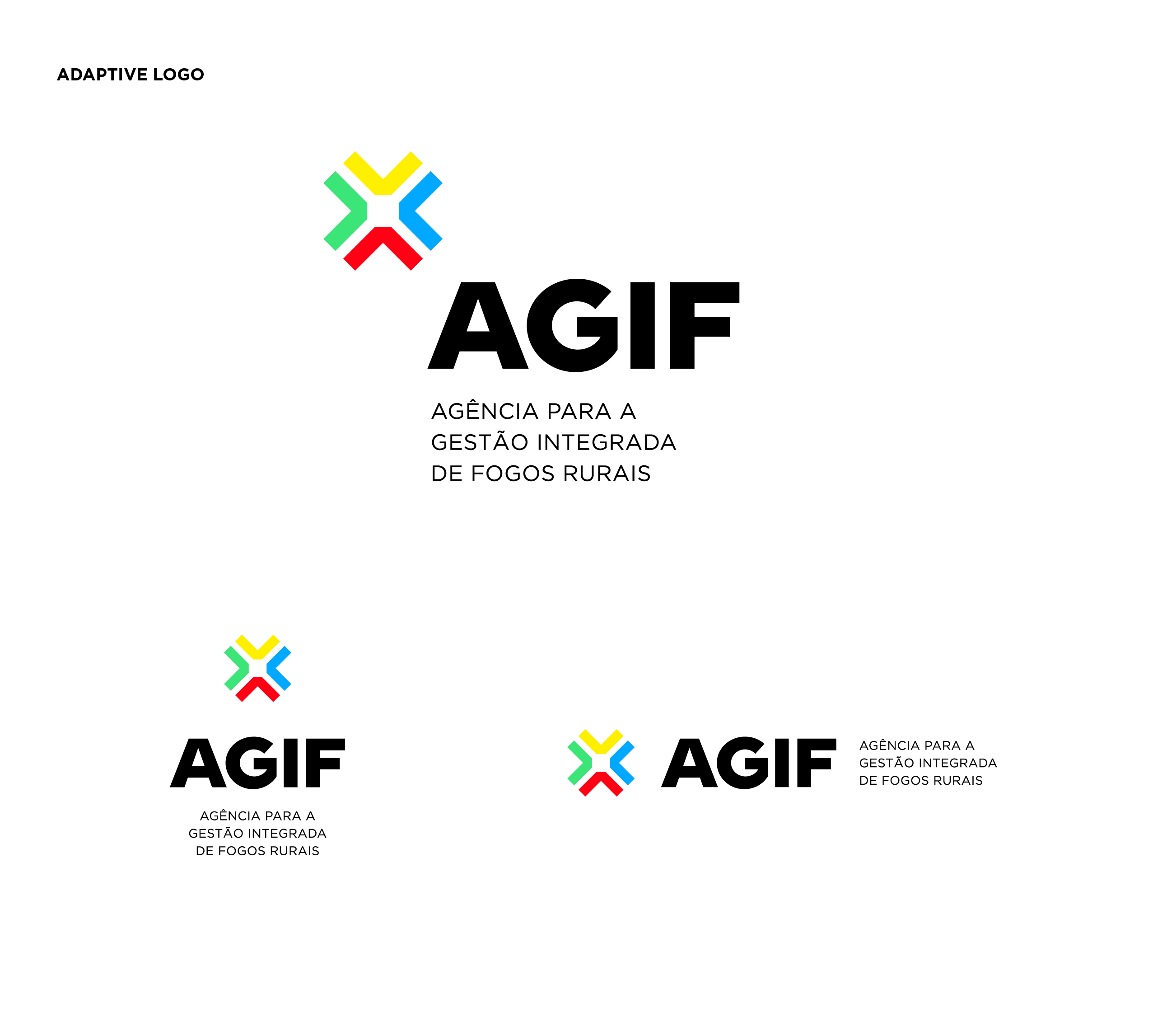
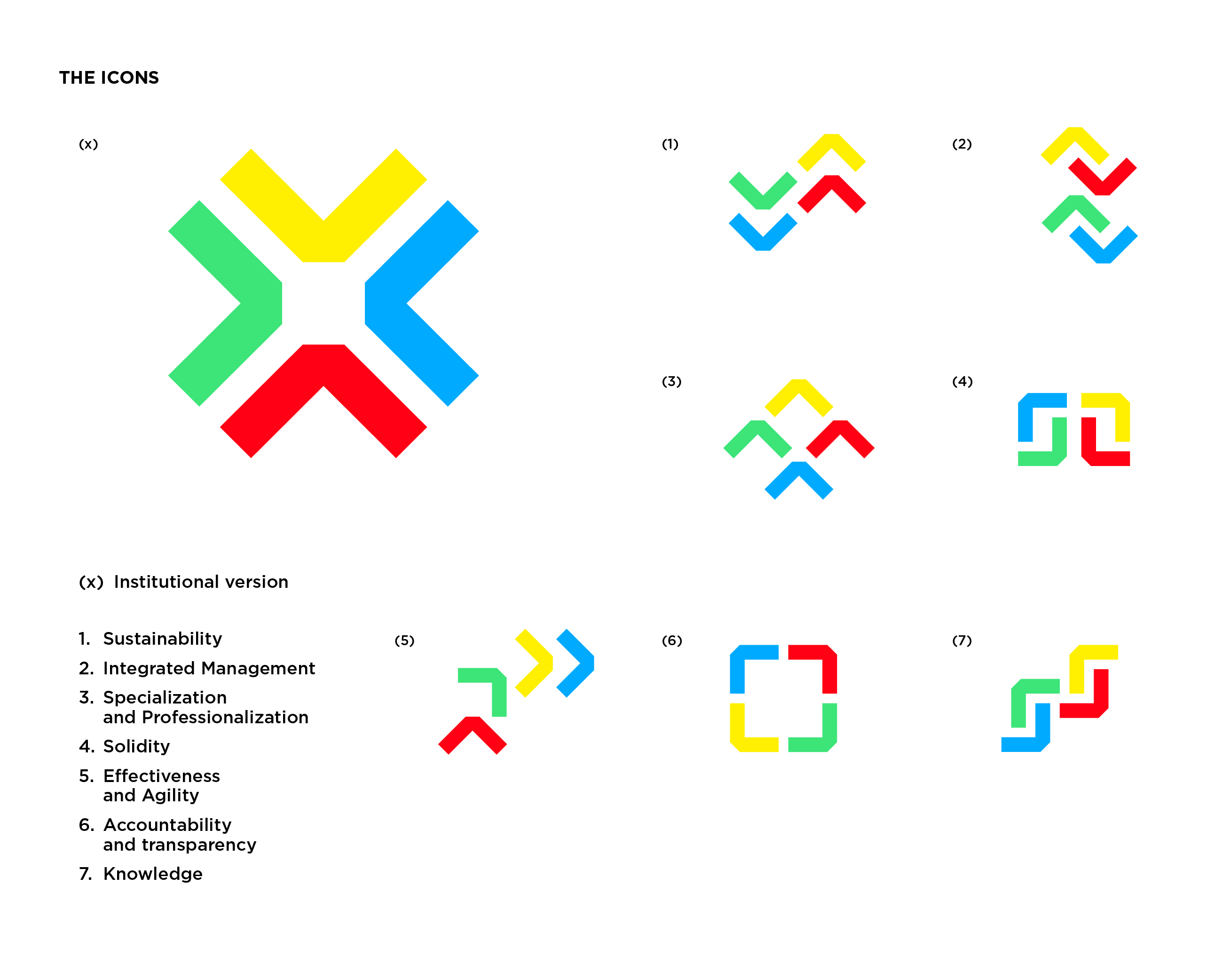
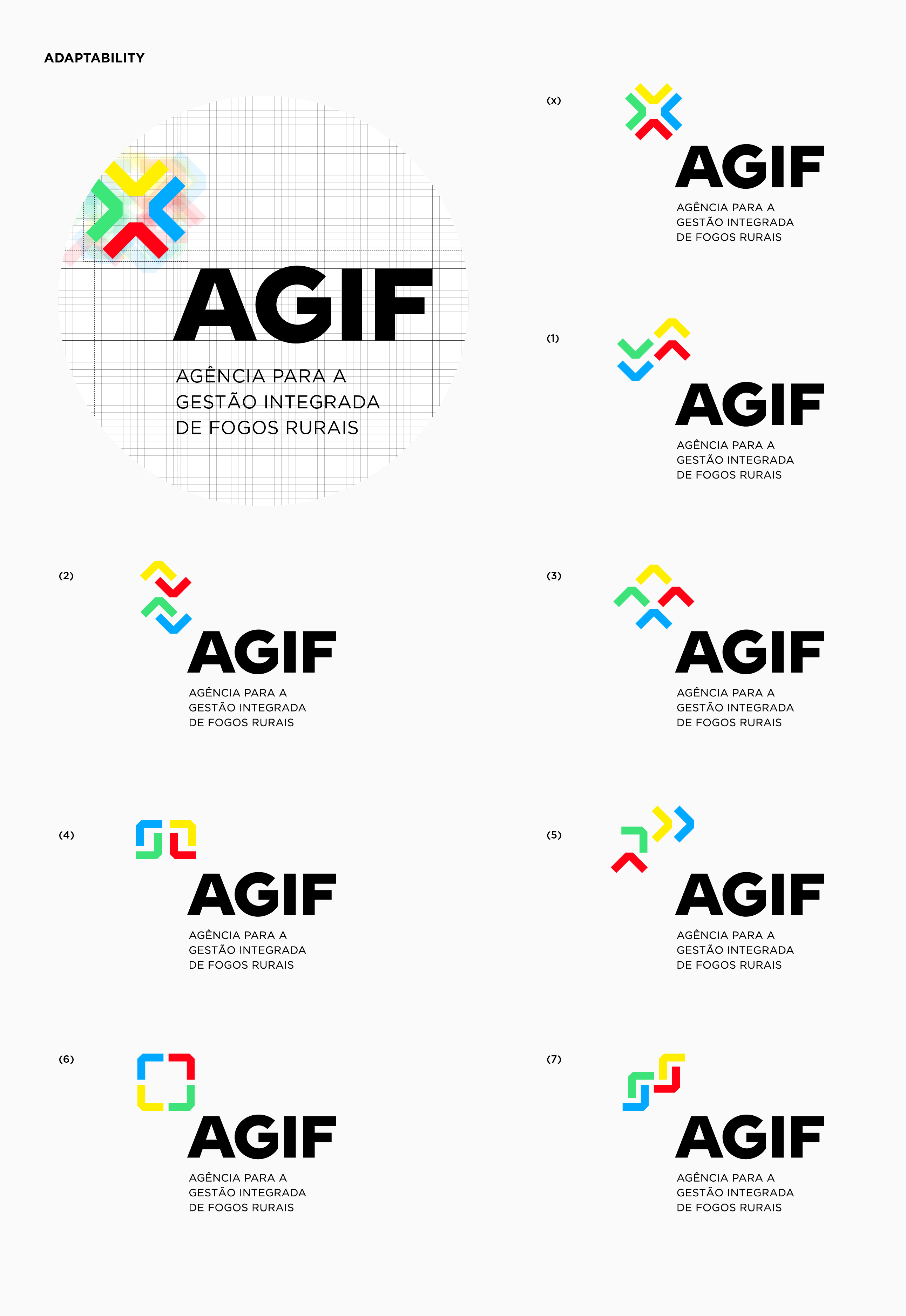
Adaptability
A symbol that unfolds into a multiplicity of identities, according to the 7 principles of the integrated rural fire management system, and which demonstrates AGIF's comprehensive and inclusive problem-solving capacity. Thus, 7 new icons were developed that are part of the agency's basic guiding action principles.
1. Sustainability / 2. Integrated Management / 3. Specialization and Professionalization / 4. Solidity / 5. Effectiveness and Agility / 6. Accountability and transparency / 7. Knowledge
A symbol of integration, focus, logic and learning, that creates an ecosystem dedicated to everything involved in the management of rural fires: from information to knowledge, prevention to combat, and enhancement of the natural heritage to behavioural change.
The Colours
AGIF’s 4 Natural Elements
Red = Fire / Yellow = Sun / Blue = Water / Green = Forest
Google Effect
A combination of colours that contributes to the brand identity’s memorization, and positions AGIF, namely online, as an entity where you can research everything related to fire.
Adaptability
A symbol that unfolds into a multiplicity of identities, according to the 7 principles of the integrated rural fire management system, and which demonstrates AGIF's comprehensive and inclusive problem-solving capacity. Thus, 7 new icons were developed that are part of the agency's basic guiding action principles.
1. Sustainability / 2. Integrated Management / 3. Specialization and Professionalization / 4. Solidity / 5. Effectiveness and Agility / 6. Accountability and transparency / 7. Knowledge