MEO TEXT
Typography for a Portuguese Communications and Internet Company
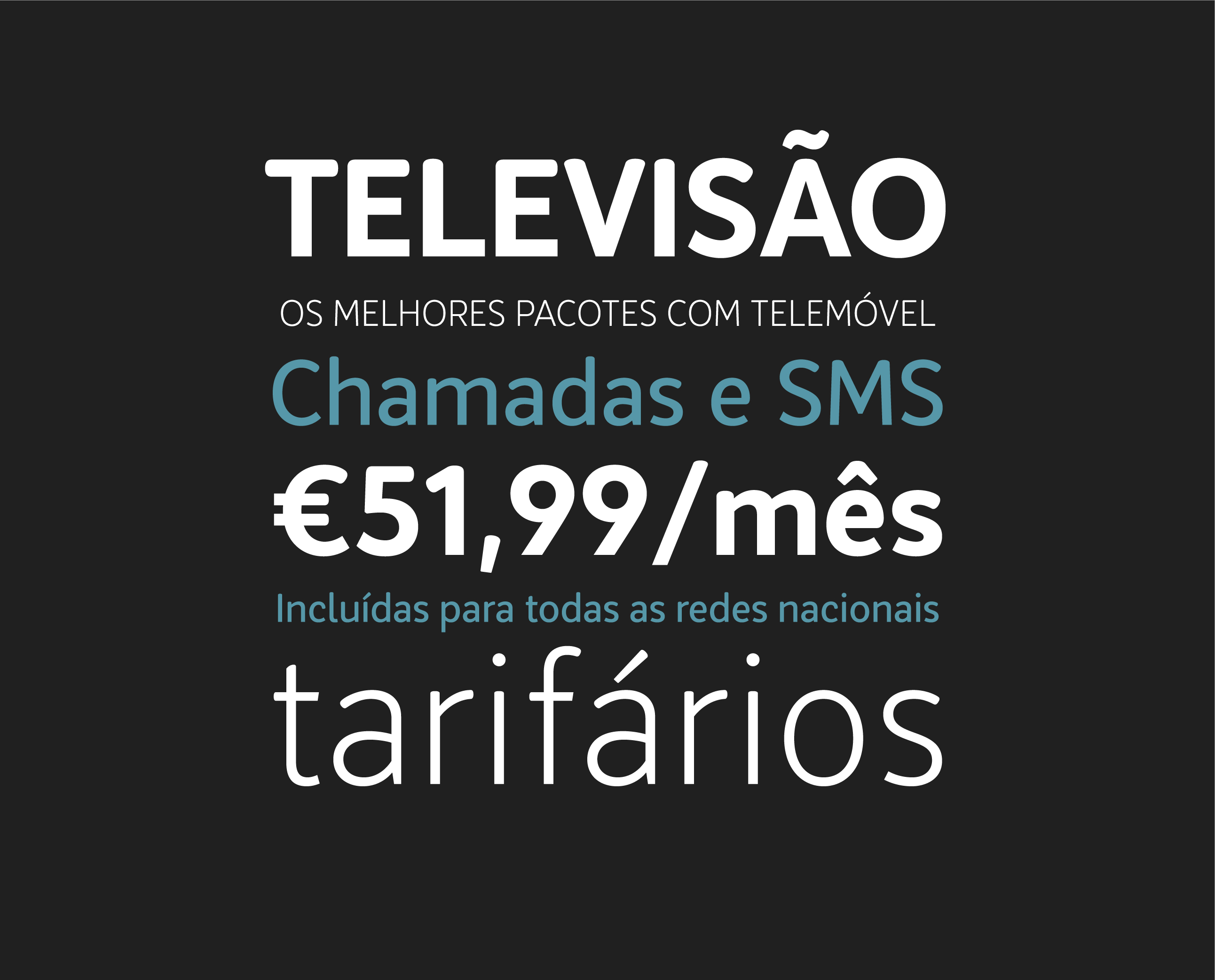
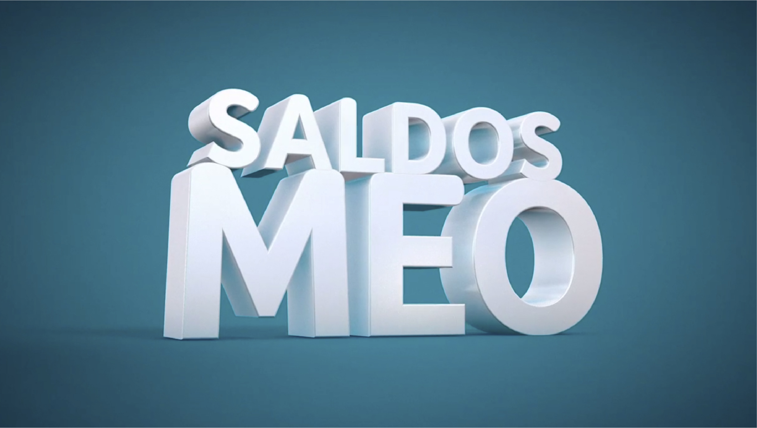
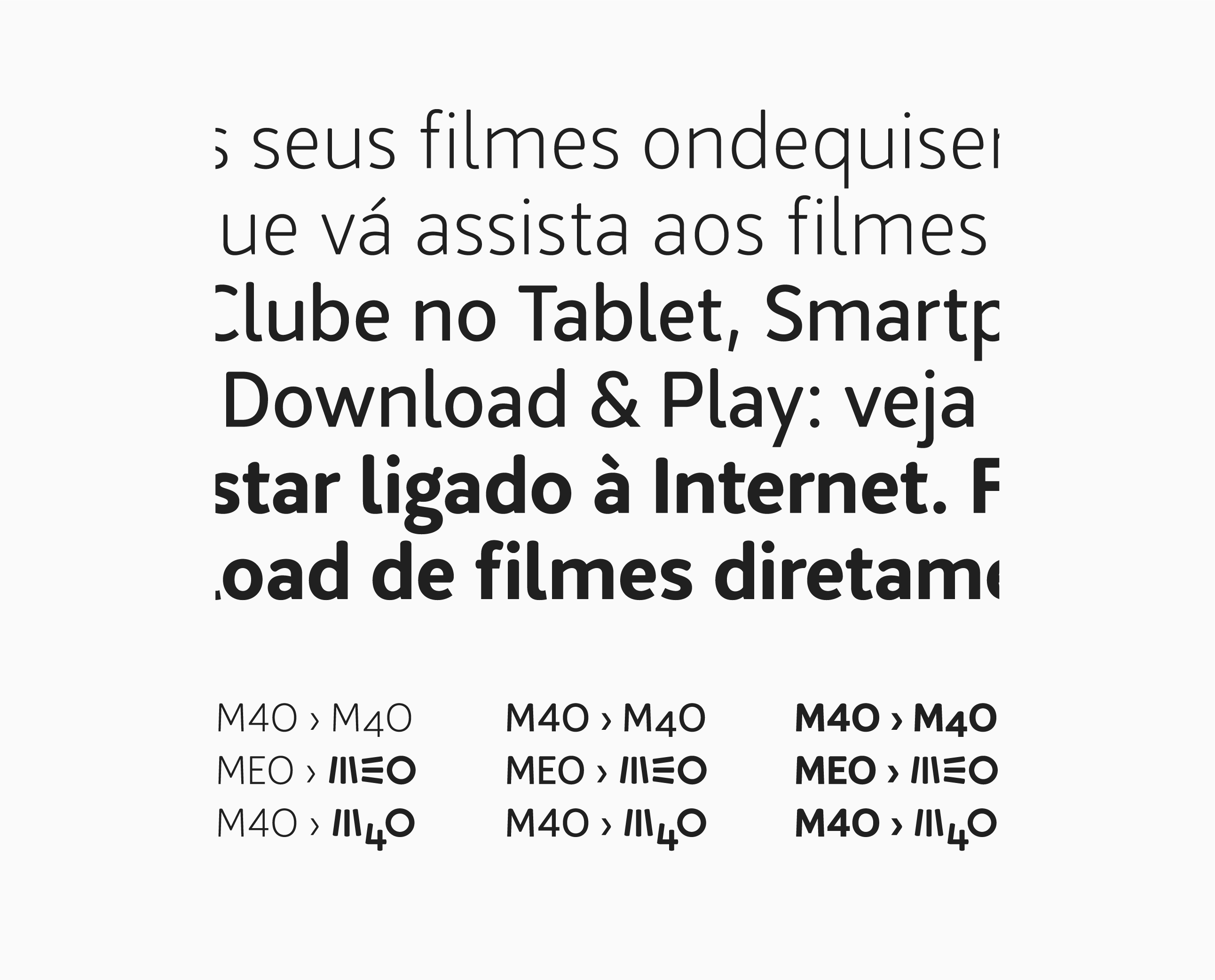
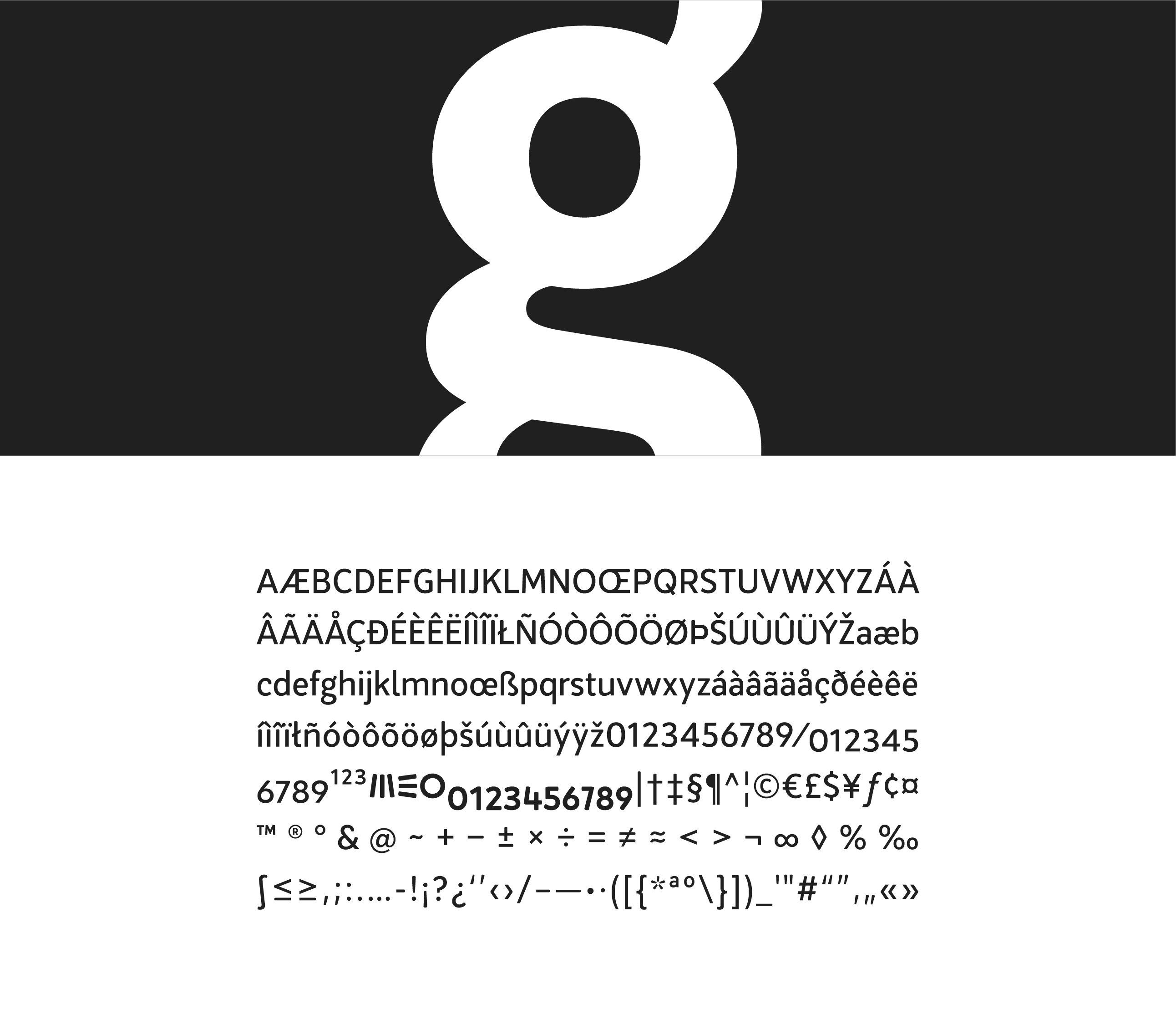
In addition to possessing good readability, the design of the characters had to maintain a close connection to the previous typography, as well as the present logo. We were challenged with the task of trying to tackle one of the main problems with text use on TV: the small, condensed space. The result? The MEO TEXT type family was designed for the MEO brand to use in digital media. Three weights were designed: Light, Regular and Bold, with the inclusion of MEO logo + special numeric characters for a practical use in web support.




Agency/Creative direction: Partners
Type design: GonçAlves
Type design: GonçAlves
