
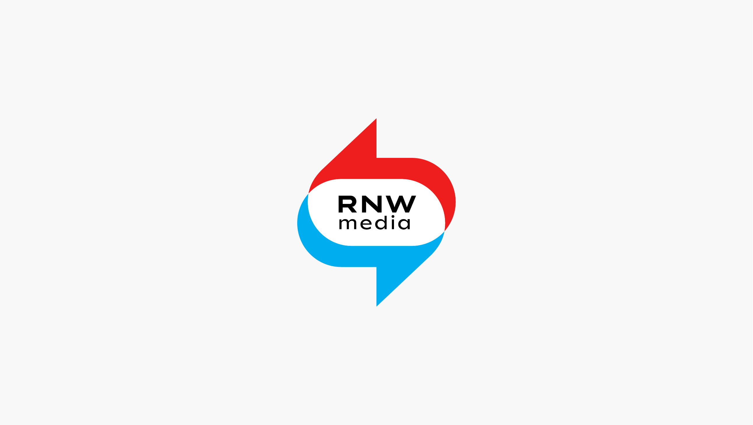
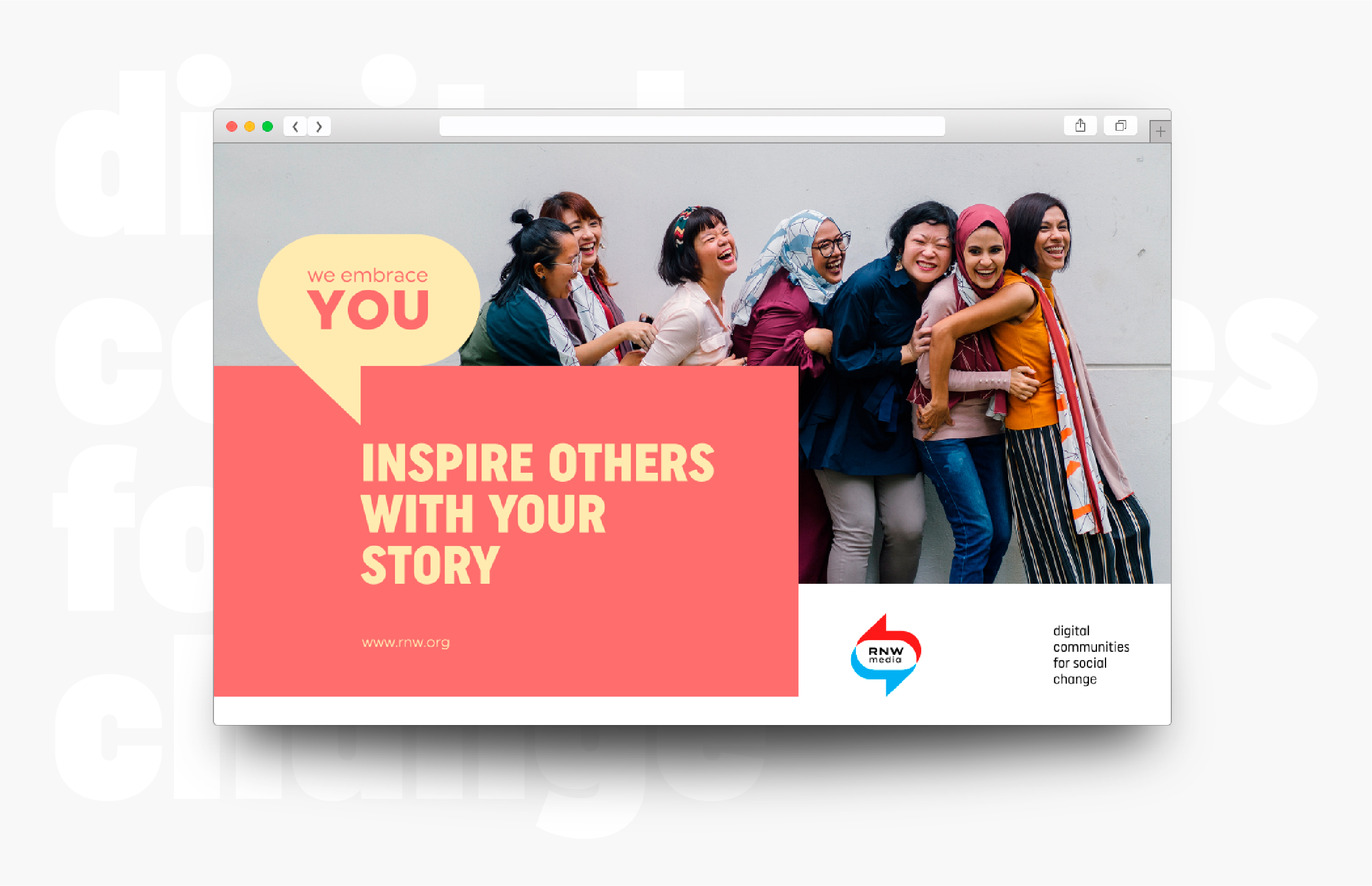
RNW media
Digital communities for social change. International organisation based in the Netherlands.
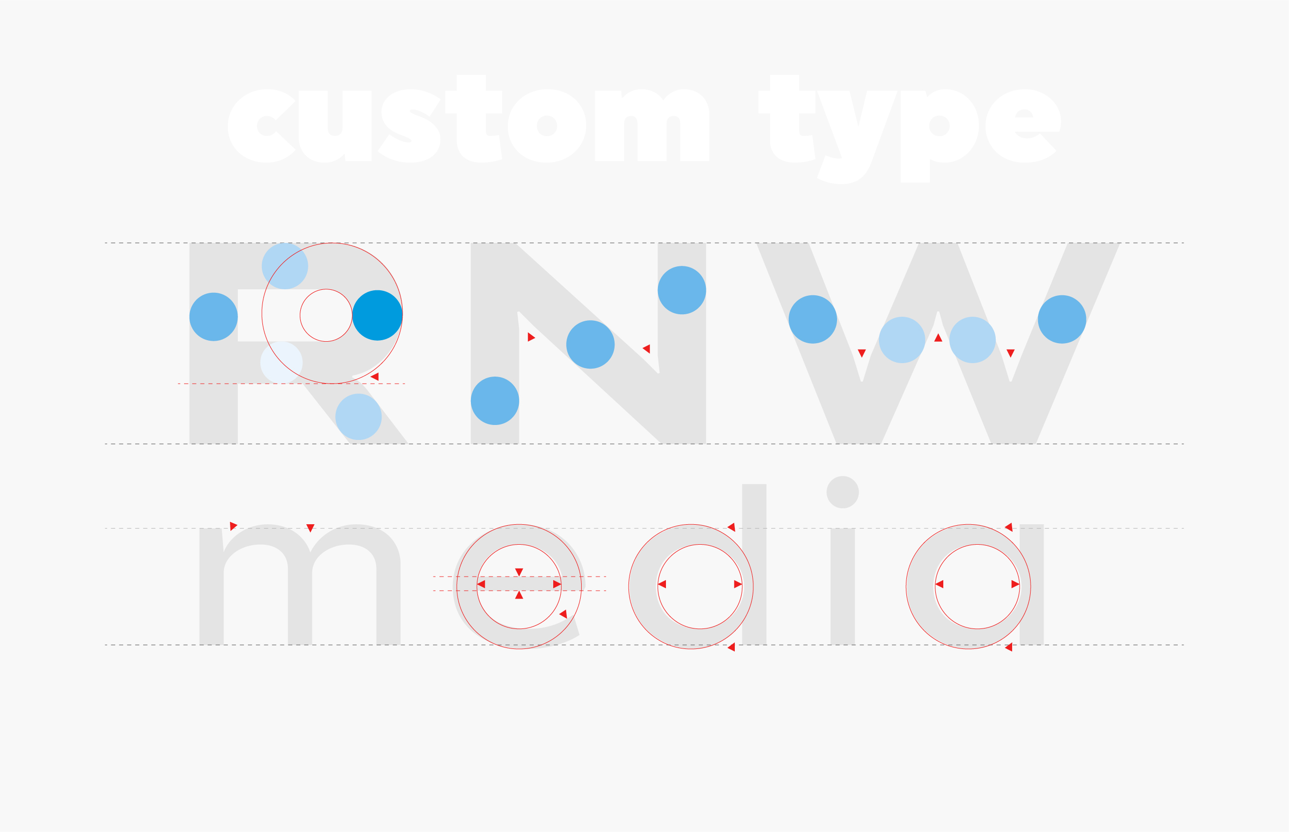
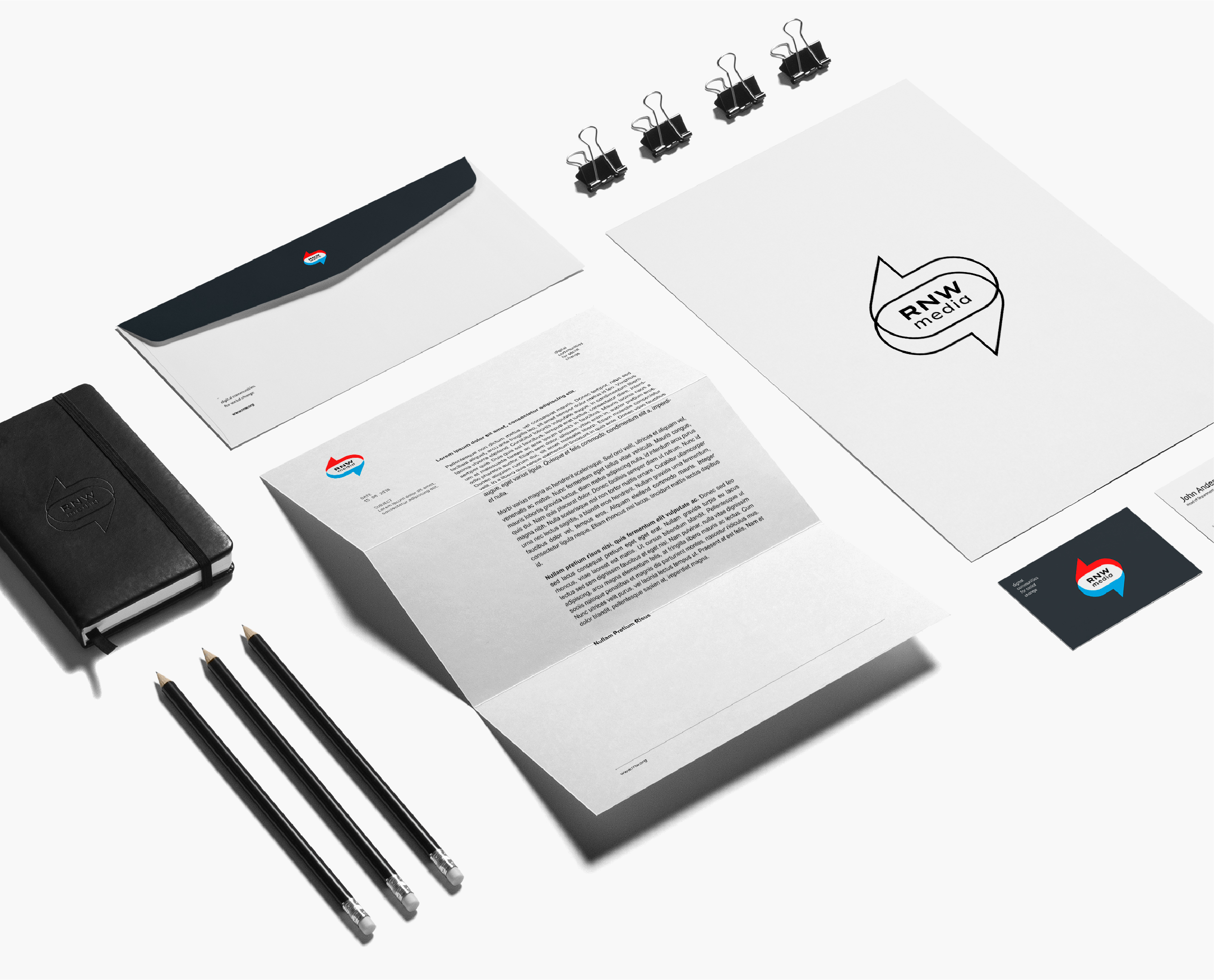
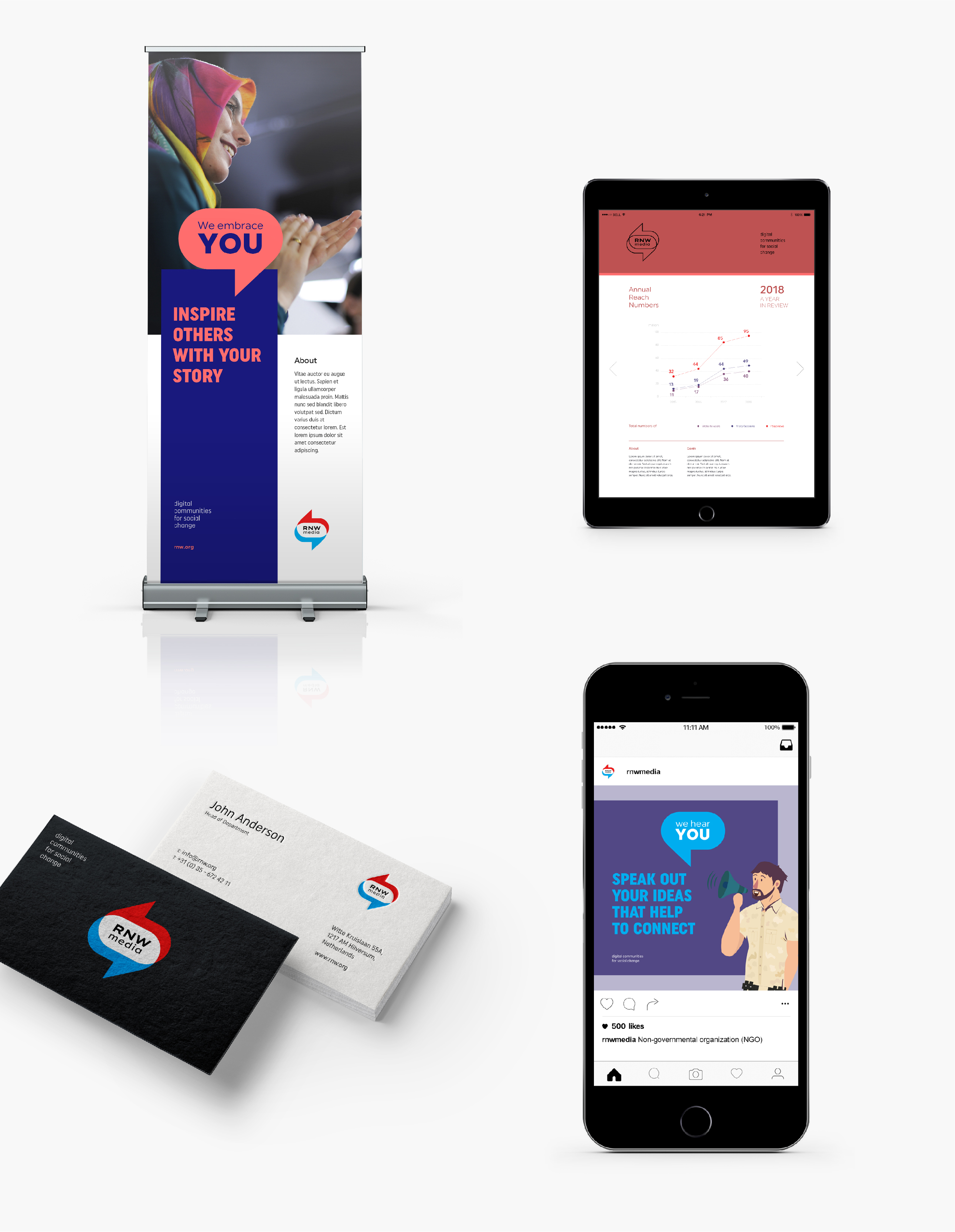
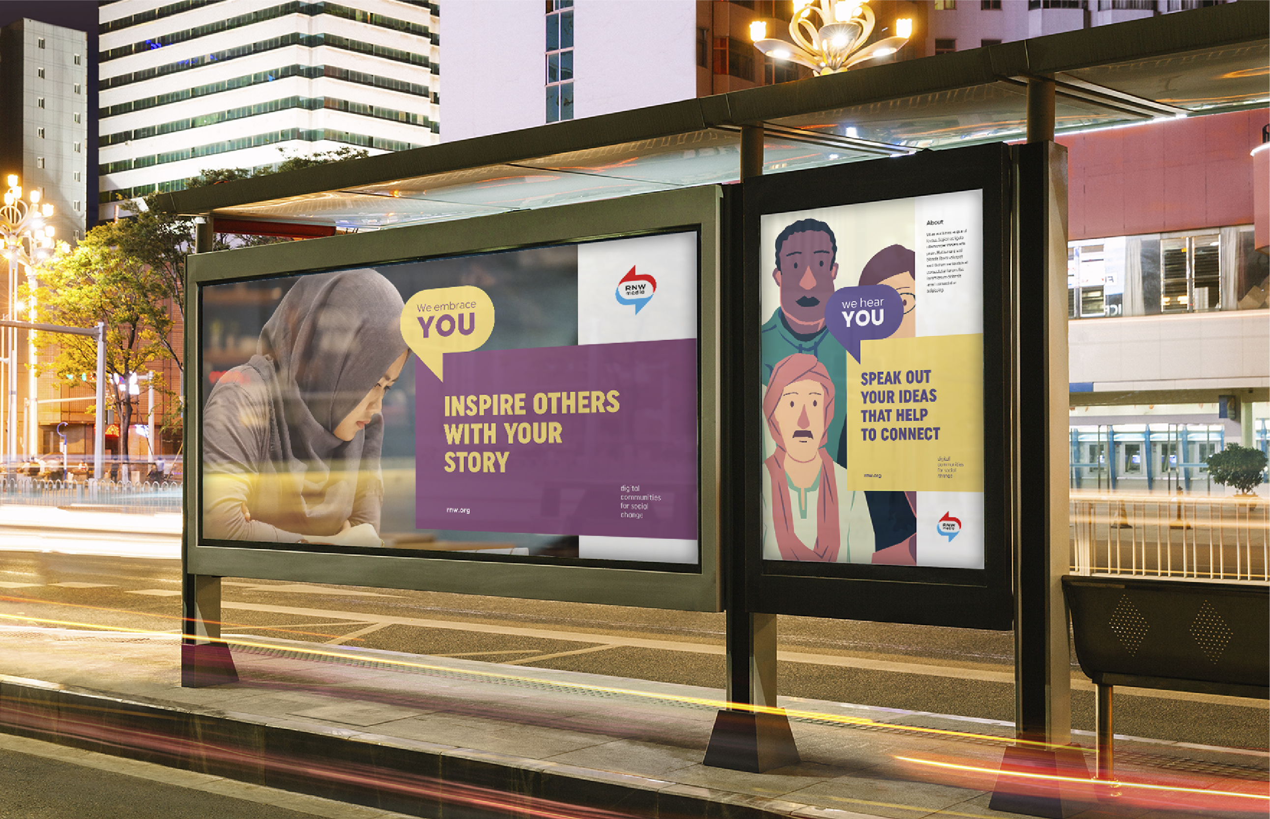
This project was a logo and brand redesign. The logo consists of an icon and lettering. In this case, the lettering is composed of the RNW monogram and the MEDIA suffix.
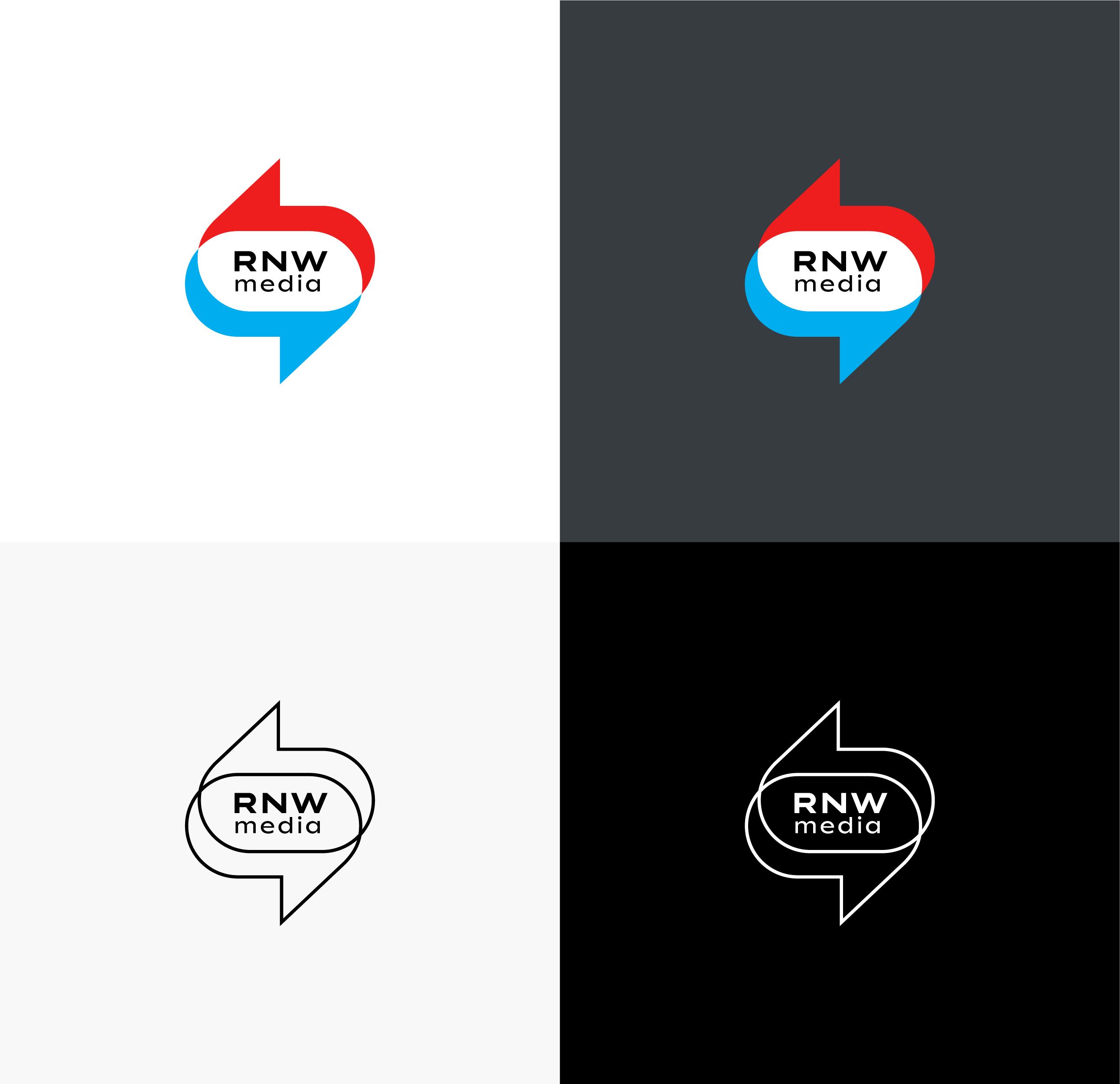
The monogram and the suffix, in the old logo composition, exist separately. This allows people, when speaking and writing about the RNW MEDIA brand, to drop the suffix and use only the monogram–RNW.
To solve the problem we suggest that in the logo composition, the monogram and the suffix should be placed in close proximity and that RNW should be written in uppercase.

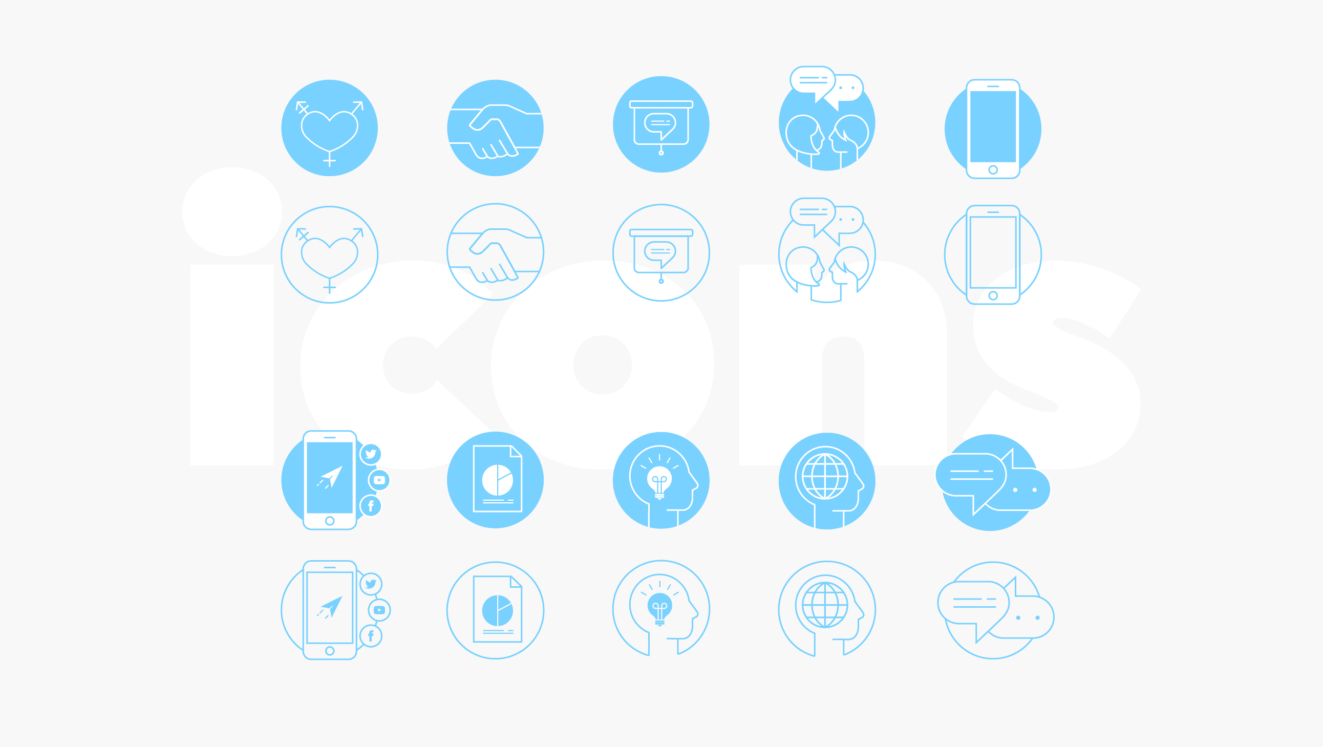
As a solution, we suggest that the lettering made with custom type and use the Uniform type family for the brand communication.
Client: RNW media
Executive Creative Director: Inês Morais
Copy: Ricardo Henriques
Logo + Design + Art direction: GonçAlves
Animation: HomemBala
Executive Creative Director: Inês Morais
Copy: Ricardo Henriques
Logo + Design + Art direction: GonçAlves
Animation: HomemBala